CCTV 2 speaks an own iconic language
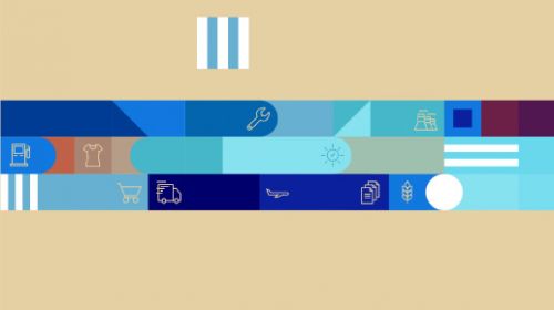
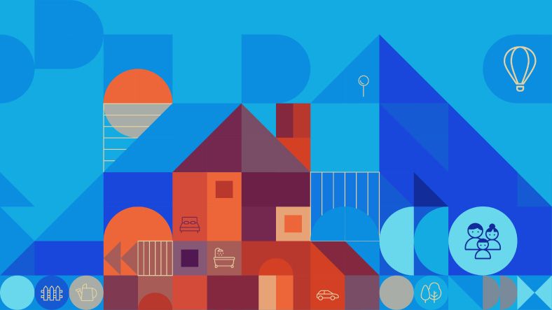
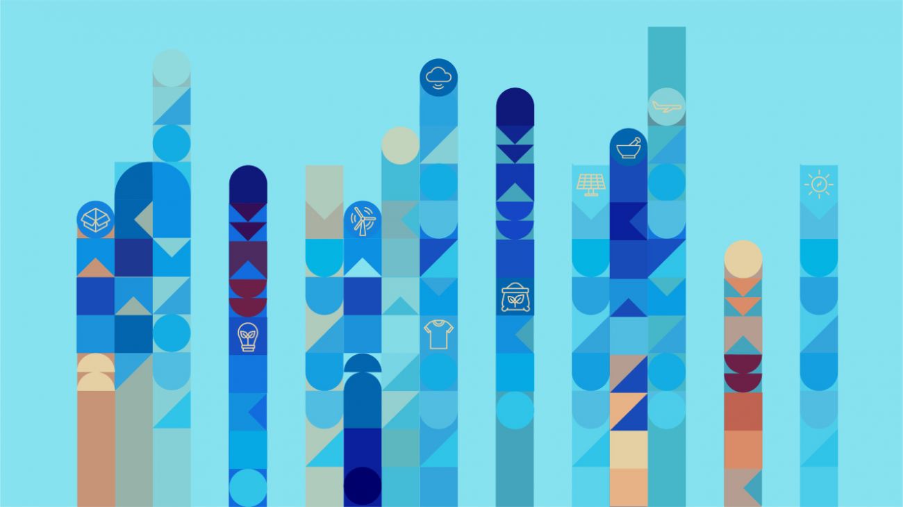
Inspired by the square-shaped logic of the Chinese Alphabet we designed an iconographic & pictorial language to cater for the multitude of needs in the daily broadcast routine. The lively, versatile and easy applicable toolkit guarantees a distinctive and consistent on-air image. The flat design combined with its rich playfulness attracts viewers of all ages including the "smart generations".
Bits and bytes
The logo bug is designed as a crossbreed of an arrow and a data cloud and symbol of the 24/7 activity of the markets.
All you need to know about Business in China
The toolkit allows to tell different stories by loading the alphabet with topic related icons. As a result we produced four Idents with the channel's core competencies in a color range representing the whole day – from the morning sun until late night.


What's relevant today.
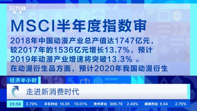
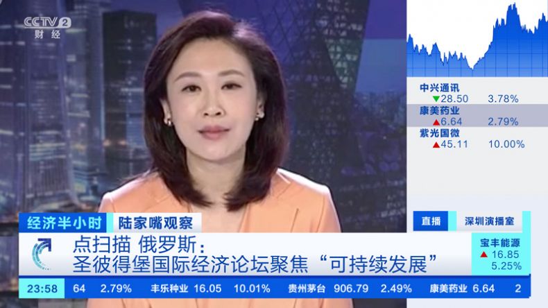
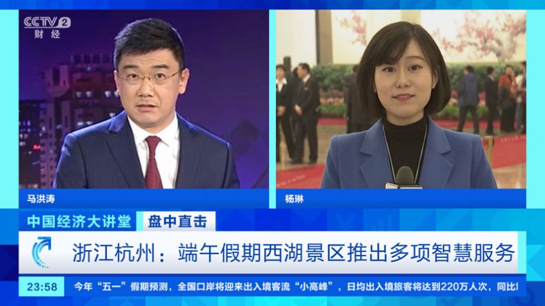
The squared grid of the alphabet build the base of the framework for the on-air design. The bold look and strict color range define a clear arrangement of mostly simultaneous news and business information.


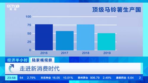
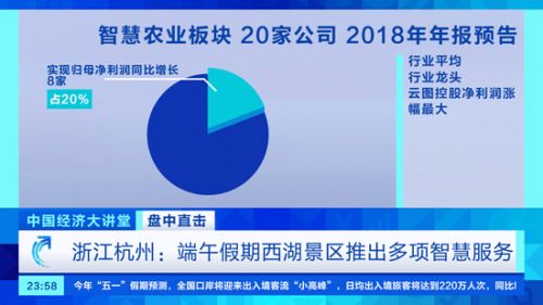
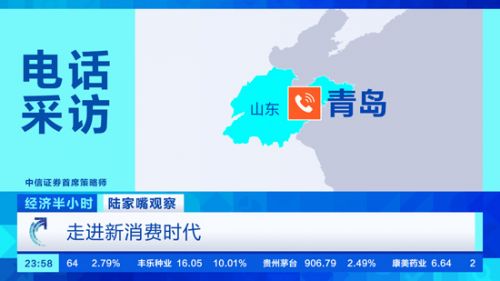
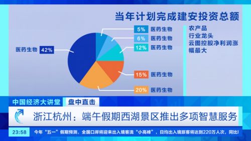
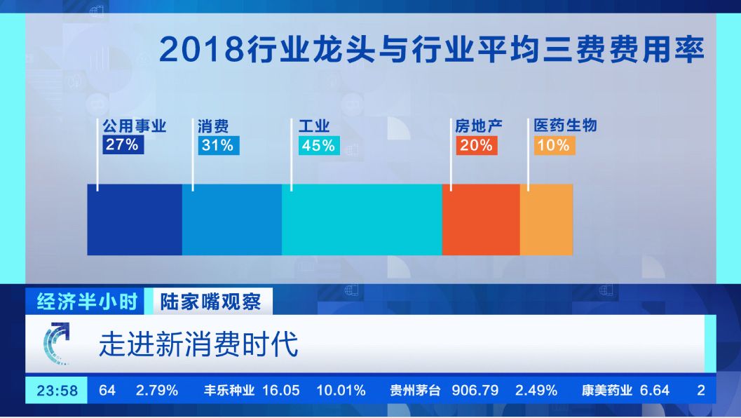
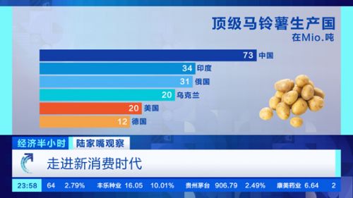
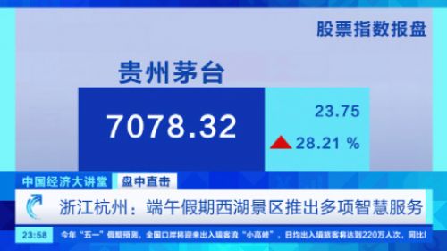
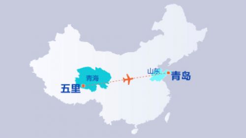
Toolkit for maps and infographics
Credits
Client: CCTV 2, China Central Television • Agency: Flint Skallen / Stefan Mueller • Created and produced by Perfect Accident • Creative Team: Elisa Krenz, Michaela Wiesinger, Constanze Müller, Joana Leal, Carmen Hirschfeld, Andrea Bednarz, Martin Kett • Set design by Billionpoints • Music by Massive Music