Current Time‘s news segment stands out through a fresh, bold and eye-catching look.
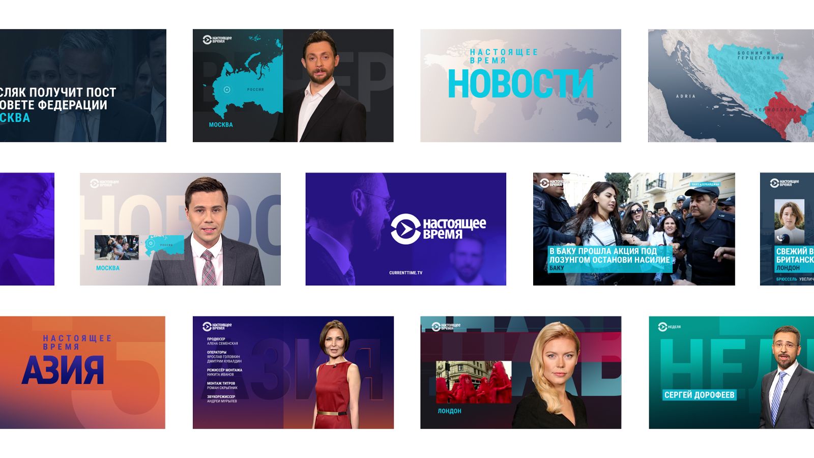
After launching Current Time at the end of 2016 we worked on a consistent design of its news identity. All main news shows were designed in a corporate brand style, still keeping individual characteristics.
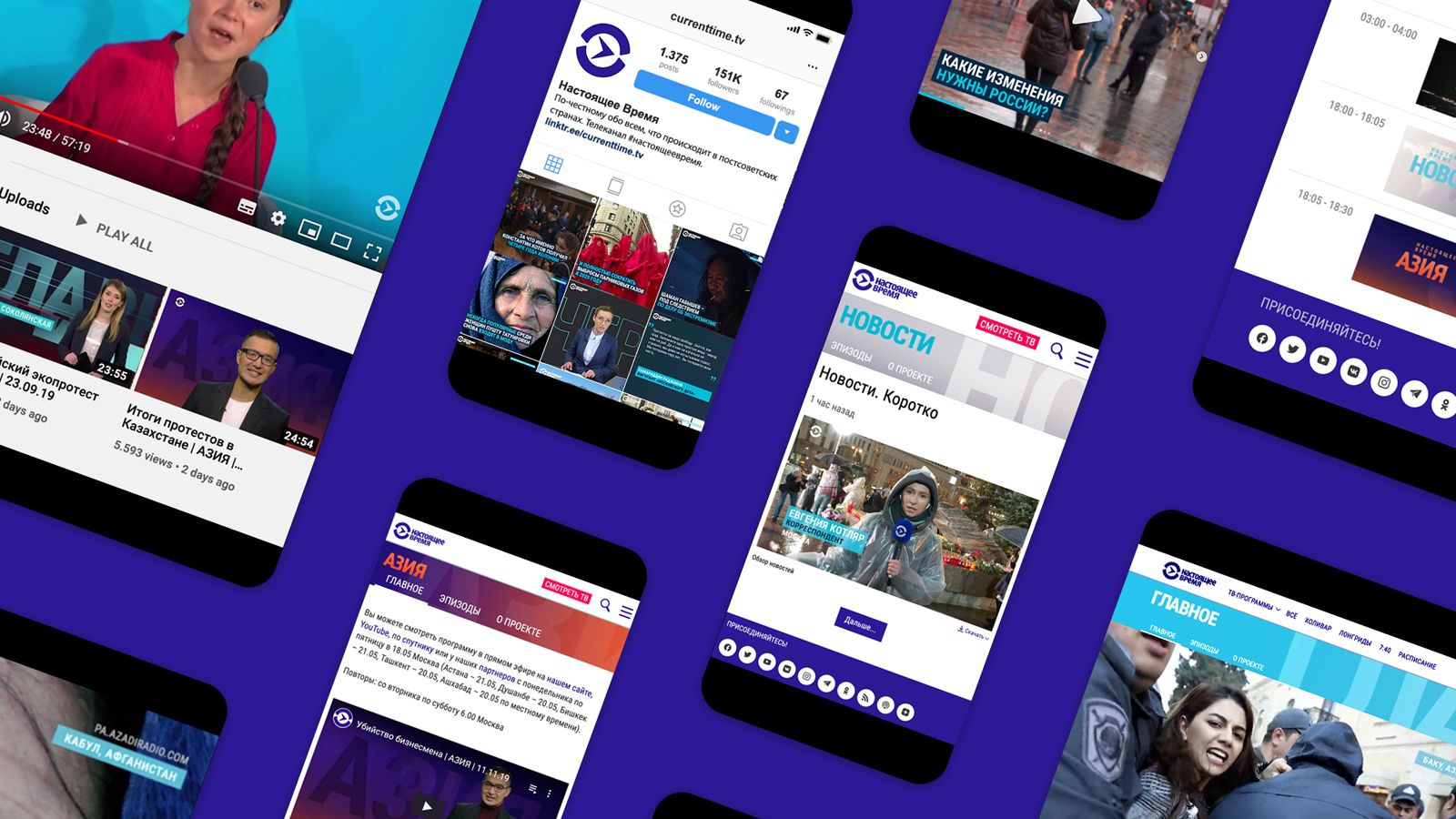
Cross-platform
identity
Working across various platforms we consequently adapted the design to all brand elements for on-air, online and off-air application.
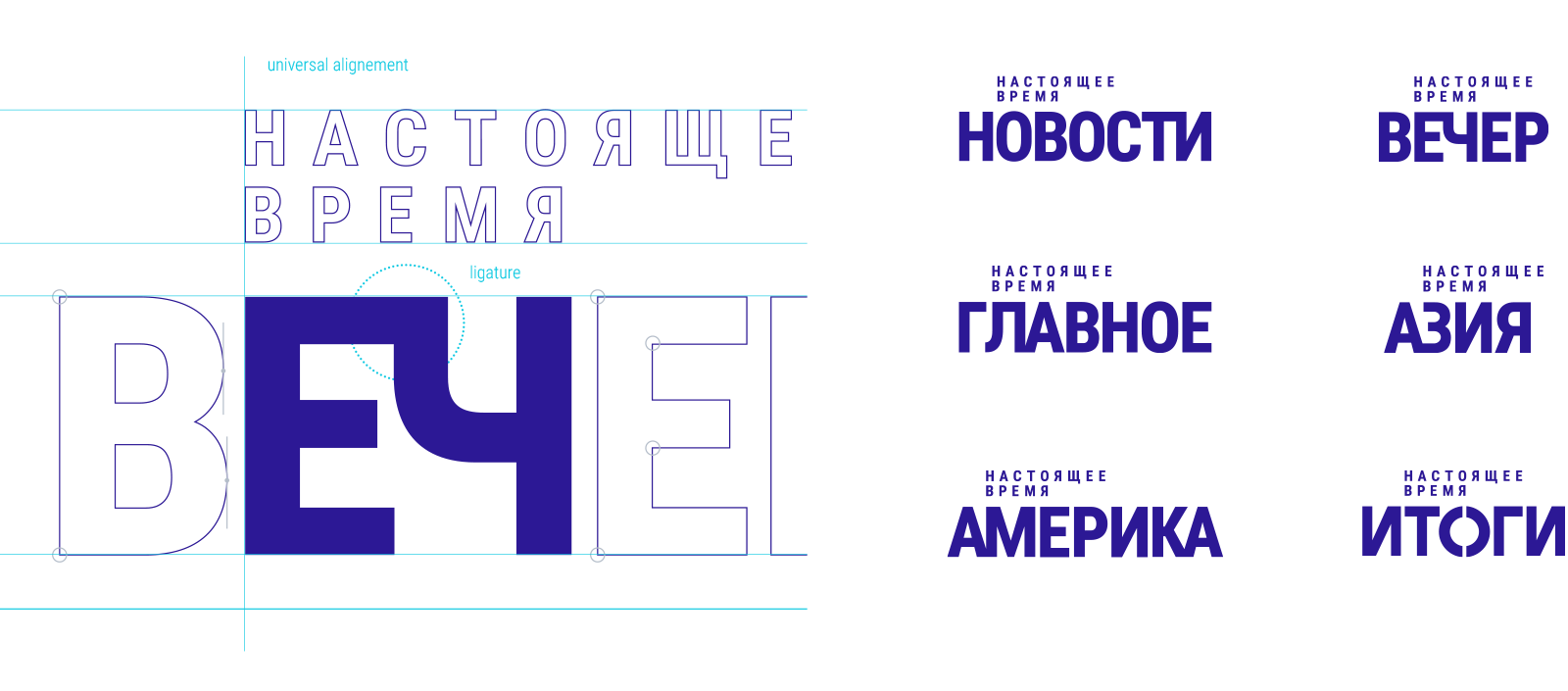
Modular logo family
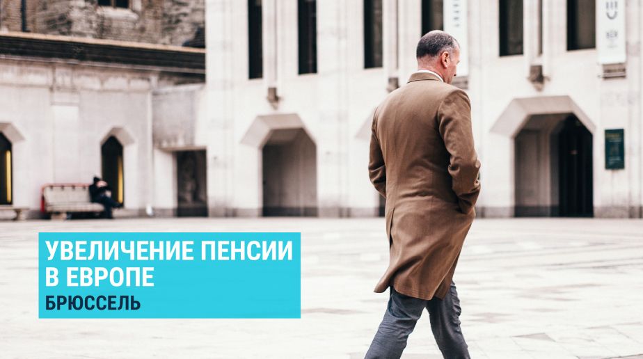
Screen real estate
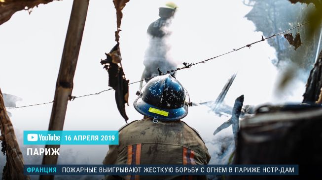
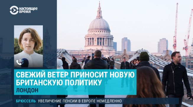
All news shows use the same universal design elements, free from unnecessary decoration.
Reduced shapes, striking colors, big typography solely serve the information.



Maps and infographics
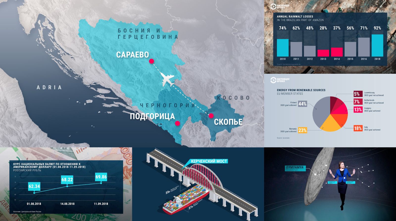
We provided a full set of infographic guidelines and case studies which allows Current Time designers to create diverse graphics within the unique TV package.
Seven individual shows, one unifying concept
News shows work within a design system and follow a common principle: a clean graphic style, compact logo design, use of typography, and dramatic color gradients. However, they all have individual concepts and their own distinct color palettes, animations and music compositions.
Main design principles:
- liberation from all set deco elements
- no fake news sets
- conscious use of the virtual studio condition
- use of typography as information
- news and information are literally in the foreground.

A functional design language with emphasis on the content
Credits
Client: CurrentTime TV, RFE/RL • Created and produced by Perfect Accident • Creative Team: Elisa Krenz, Joana Leal, Andrea Bednarz, Christiane Scheibe, Benno Verschueren, Patrick Becher, Martin Kett • Music by Florian Riedl